파이썬 라이브러리: Matplotlib
1. 데이터 시각화
- 데이터 시각화 개요
- 정보와 데이터를 그래프로 나타내는 것
- 차트, 그래프, 맵과 같은 시각적 요소를 사용하여, 데이터에서 추세, 이상 값 및 패턴을 보고 이해할 수 있도록 해 주며
- 데이터 분석에 쉽게 접근할 수 있도록 하는 방법
- 특히 빅 데이터의 세계에서, 데이터 시각화 도구와 기술은 막대한 양의 정보를 분석하고 데이터 기반 의사 결정을 내리는 데에 필수적
- 데이터 시각화의 필요성
- 인간은 시력을 통해 얻는 정보양은 다른 기관의 정보보다 훨씬 많음
- 지나치게 많은 데이터로 인해 이를 관리하고 이해하는 어려움이 계속해서 증가
- 대부분의 사람들은 통계 데이터에 대해 잘 알지 못하며, 기본적인 통계 방법(평균, 중위수, 범위 등)은 인간의 인지적 성격과 맞지 않음
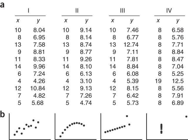
- 통계 방법에 따라 규칙을 보는 것은 어렵지만, 데이터가 시각화되면 규칙은 매우 명확히 인지 가능(예: 안스콤비의 4중주)
2. Matplotlib 개요
Matplotlib란?
- 파이썬에서 플롯(그래프)을 그릴 때 주로 쓰이는 2D, 3D 플롯팅 패키지(모듈)
- 저명한 파이썬 라이브러리 개발자인 John Hunter에 의해 개발됨
- 2003년 version 0.1이 발표된 이후 현재까지 꾸준히 발전해온 약 20년의 역사를 가진 패키지
- 산업, 교육계에서 널리 쓰이는 수치해석 소프트웨어인 MATLAB과 유사한 사용자 인터페이스를 가지고 있어 각 업계에서 쉽게 접근 가능
Matplotlib의 장점
- 동작하는 OS를 가리지 않음
- 다양한 그래프와 그 구성요소에 대하여 상세한 서식을 설정 가능
- 다양한 출력형식(PNG, SVG, JPG 등) 지원
- MATLAB과 유사한 사용자 인터페이스
3. 환경설정
모듈 임포트
import matplotlib.pyplot as plt그래프를 그리기 위한 데이터 설정
x = [-3, -2, -1, 0, 1, 2, 3, 4, 5]
y = [3, 2, -1, 1, 0, -2, -1, 3, 1]

plt.figure(figsize=(8,4))
plt.title('오늘도 즐거운 하루', fontsize=20)
plt.scatter(x, y)
plt.show()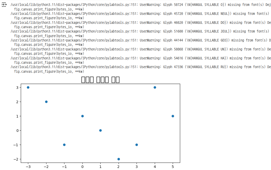
- warning메시지 무시하기
쓸데없는 경고가 많이 나오는 문제
import warnings warnings.filterwarnings('ignore')plt.figure(figsize=(8,4)) plt.title('오늘도 즐거운 하루', fontsize=20) plt.scatter(x, y) plt.show()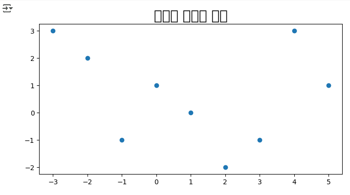
- 한글이 깨지는 문제
이유: 한글 폰트가 설치되어 있지 않기 때문
# 현재 사용중인 폰트 확인 plt.rcParams['font.family'] # 한글폰트 설치하기 위해 필요한 모듈 import matplotlib.font_manager as fm # 나눔바른고딕 폰트 설치 - 런타임 연결이 다시 될 때마다 다시 폰트를 설치해야 한글이 보인다. !apt install fonts-nanum fm.fontManager.addfont('/usr/share/fonts/truetype/nanum/NanumBarunGothic.ttf') plt.rcParams['font.family'] = "NanumBarunGothic"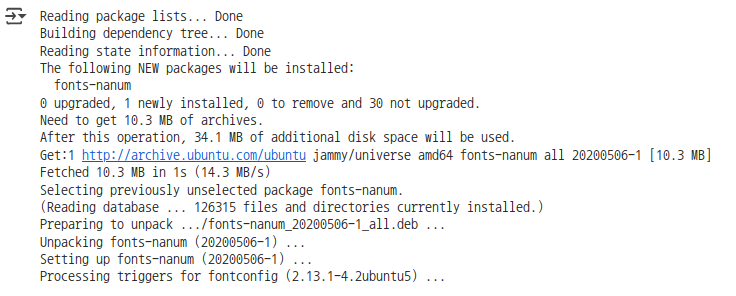
plt.figure(figsize=(8,4))
plt.title('오늘도 즐거운 하루', fontsize=20)
plt.scatter(x, y)
plt.show()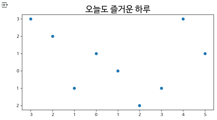
- 갑자기 음수 부호(-)가 표시되지 않음
한글폰트와 유니코드의 음수 부호가 충돌을 일으키기 때문
# 마이너스(음수)부호 설정
plt.rc("axes", unicode_minus = False)

plt.figure(figsize=(8,4))
plt.title('오늘도 즐거운 하루', fontsize=20)
plt.scatter(x, y)
plt.show()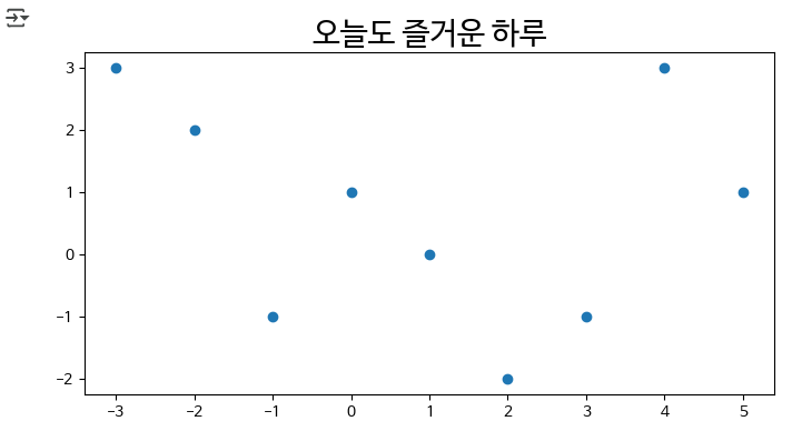
- 그래프를 그릴때 별도의 창이 열리고 그 위에서 그려지는 문제
- Colab을 이용하는 경우
- Colab은 기본적으로 현재 창에서 그래프가 그려지므로 따로 조치할 필요가 없음
- 개인 환경에서 Jupyter Notebook/Lab을 이용하는 경우
%matplotlib inline 명령어를 통해서 해결 가능
%matplotlib inline
- Colab을 이용하는 경우
4. 기본 그래프 그리기
그래프의 기본 구성
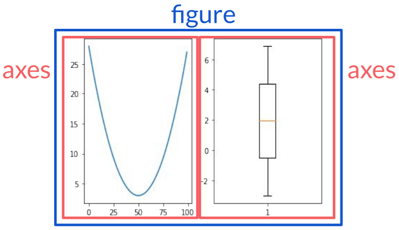
4.1 Figure
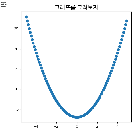
- 데이터 설정
- \(-5 < x < 5\) (x의 간격은 0.1), \(y_1 = x^2 + 3\)
  import numpy as np
  x = np.arange(-5, 5, 0.1)
  y1 = x**2 + 3
그래프 그리기
  # figure 크기 조정하기
  plt.figure(figsize=(5,5))
  plt.title('그래프를 그려보자', fontsize=15)
  plt.scatter(x, y1)
  plt.show()
4.2 그래프 여러 개 그리기
- Figure 객체와 axes를 직접 생성 후 생성된 axes에 대한 plot 멤버를 직접 호출하는 방법
fig = plt.figure()
axs = fig.subplots(1,2)- pyplot.subplots 으로 Figure와 axes를 생성하는 방법
fig, axs = plt.subplots(1,2)
- Figure 객체 생성 후, axes 추가하는 방법
fig = plt.figure()
ax1 = fig.add_subplot(1, 2, 1)
ax2 = fig.add_subplot(1, 2, 2)
\(-5 < x < 5\) (x의 간격은 0.1), \(y_1 = x^2 + 3\) , \(y_2 = x + 2\)
y2 = x+2 y2fig, axs = plt.subplots(2,3) axs[0, 0].plot(x, y2) axs[0, 1].plot(x, y1) axs[0, 2].plot(x, y2) plt.show()# 사이즈 조절 figsize=(,) fig, axs = plt.subplots(1,2, figsize=(10,5)) axs[0].plot(x, y2) axs[1].plot(x, y1) plt.show()fig = plt.figure(figsize=(10,5)) ax1 = fig.add_subplot(1, 2, 1) ax2 = fig.add_subplot(1, 2, 2) ax1.plot(x, y2) ax2.plot(x, y1) plt.show()# [참고] pyplot API 방식. 위 그래프와 같다 # 사이즈 설정 plt.rcParams["figure.figsize"] = (10,5) plt.subplot(1,2,1) plt.plot(x, y2) plt.subplot(1,2,2) plt.plot(x, y1) plt.show()plt.rcParams["figure.figsize"] = (6, 6) fig, axs = plt.subplots() axs.plot([1,2,3,4], [100,200,300,400]) plt.show()세로로 화면을 분할하여 그래프를 그려보기
  fig=plt.figure()
  ax1=fig.add_subplot(2,1,1)
  ax2=fig.add_subplot(2,1,2)

  ax1.plot(y1)
  ax2.plot(y2)

  plt.show()
그래프에 가로선 그어보기
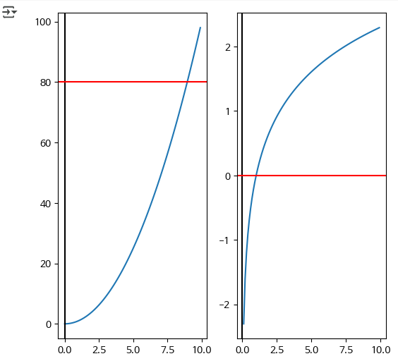
- x = range(0, 10)
- \(y_1=v^2\) (→ y1 = [v*v for v in x] )
\(y_2=log(v)\) (→ y2 = [np.log(v) for v in x] )
  x = np.arange(0, 10, 0.1)
  y1 = x ** 2
  y2 = np.log(x)

  fig = plt.figure()
  axs = fig.subplots(1,2)
  axs[0].plot(x, y1)
  axs[1].plot(x, y2)
  axs[0].axvline(x=0, color = 'k') # draw x=0 axes (Y축)
  axs[0].axhline(y=80, color = 'r') # draw y=0 axes (X축)
  axs[1].axvline(x=0, color = 'k') # draw x=0 axes (Y축)
  axs[1].axhline(y=0, color = 'r') # draw y=0 axes (X축)
  plt.show()
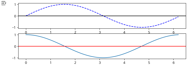
- 2행 1열의 axes에 \(sin(x)\) 그래프와 \(cos(x)\) 그래프 그려보기
- x축을 표시하시오
- x의 범위는 0부터 2*pi까지, 0.1 간격으로
- sin_y = np.sin(x)
cos_y = np.cos(x)
  fig = plt.figure(figsize=(9,3))
  axs = fig.subplots(2, 1)

  x=np.arange(0, 2*np.pi, 0.1)
  sin_y=np.sin(x)
  cos_y=np.cos(x)

  axs[0].plot(x,sin_y, 'b--')
  axs[0].axhline(y=0, color='k')

  axs[1].plot(x,cos_y)
  axs[1].axhline(y=0, color = 'r')

  plt.show()
4.3 Axis
xlim, ylim
ax.set_xlim([0, 10])
ax.set_ylim([0, 20])
# x값은 0~10, 1단위로 # y값은 x+10 x = np.arange(10) y = x+10 # yticks에는 [0,1,2,...9,10,11,12...,19] fig, axs = plt.subplots() axs.plot(x, y) axs.set_xlim([0, 10]) axs.set_ylim([0, 20]) plt.show()# [참고] pyplot API 방식. 위 그래프와 같다 plt.plot(x,y) #plt.axis([0, 10, 0, 20]) plt.xlim([0, 10]) plt.ylim([0, 20]) plt.show()xticks, yticks
# x값은 0~10, 1단위로
# y값은 x+10

x = np.arange(10)
y = x+10 # yticks에는 [0,1,2,...9,10,11,12...,19]

fig, axs = plt.subplots()
axs.plot(x, y)
axs.set_xlim([0, 10])
axs.set_ylim([0, 20])

axs.set_xticks([0,2,4,6,8,10])
axs.set_yticks(range(0,20))

axs.set_xticklabels(['A','B','C','D','E','F'])

plt.show()
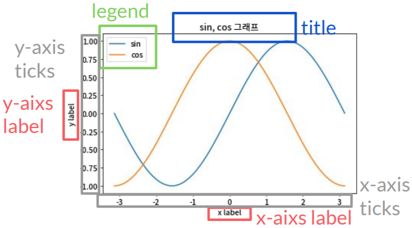
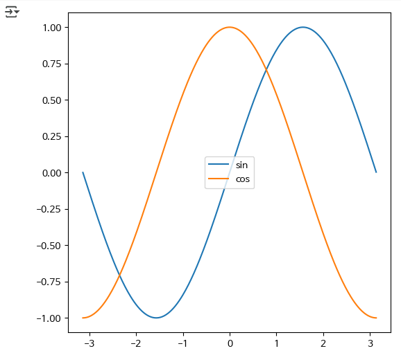
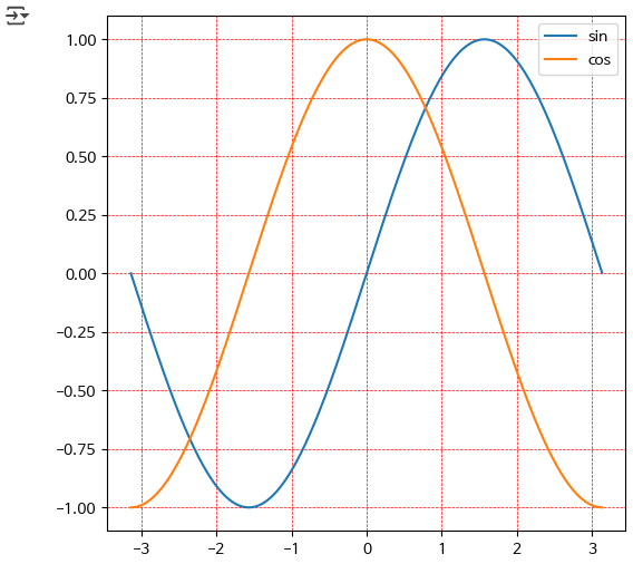
4.4 Legend
x = np.arange(-np.pi, np.pi, 0.02)
y1 = np.sin(x)
y2 = np.cos(x)

fig, ax = plt.subplots()

ax.plot(x, y1, label = 'sin')
ax.plot(x, y2, label = 'cos')

ax.legend(loc='center')
#ax.legend([line1, line2, line3], ['label1', 'label2', 'label3'])

plt.show()
# [참고] pyplot API 방식. 위 그래프와 같다

x = np.arange(-np.pi, np.pi, 0.02)
y1 = np.sin(x)
y2 = np.cos(x)

plt.plot(x, y1, label = 'sin')
plt.plot(x, y2, label = 'cos')

plt.legend(loc='center')

plt.show()
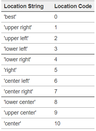
- 범례(Legend) 위치 표시 코드
4.5 Text
fig와 axes의 title
x = np.arange(-np.pi, np.pi, 0.02)
y1 = np.sin(x)
y2 = np.cos(x)

fig,axs = plt.subplots(1,2)

axs[0].plot(x, y1)
axs[1].plot(x, y2)

axs[0].set_title('sin')
axs[1].set_title('cos')
fig.suptitle('삼각함수')

plt.show()
x, y label
# [참고] pyplot API 방식. label 달기

plt.plot([1, 2, 3, 4], [2, 3, 5, 10])
plt.xlabel('X-Axis')
plt.ylabel('Y-Axis')
plt.show()

x = np.arange(-np.pi, np.pi, 0.02)
y1 = np.sin(x)
y2 = np.cos(x)

fig,axs = plt.subplots(1,2)
axs[0].plot(x, y1)
axs[1].plot(x, y2)

axs[0].set_title('sin')
axs[1].set_title('cos')
fig.suptitle('삼각함수')

axs[0].set_xlabel('x값', ha='left', va = 'top')
axs[1].set_xlabel('x값')

axs[0].set_ylabel('sin값')
axs[1].set_ylabel('cos값')

plt.show()
# label 위치 바꾸기 import matplotlib.pyplot as plt import numpy as np fig, ax = plt.subplots() ax.set_xticks(np.arange(0,6,1)) label = ax.set_xlabel('Xlabel', horizontalalignment='left', fontsize = 20) #label = ax.set_xlabel('Xlabel', ha='right', fontsize = 20) ax.xaxis.set_label_coords(1,1) # 0~1 #ax.xaxis.set_label_position('bottom') plt.show()text
x = np.arange(8)
y = x**2

fig, ax = plt.subplots()
ax.plot(x, y, 'ro')

for x_, y_ in zip(x, y):
    t = '(%d, %d)'%(int(x_), int(y_))
    ax.text(x_+0.1, y_+0.1,t)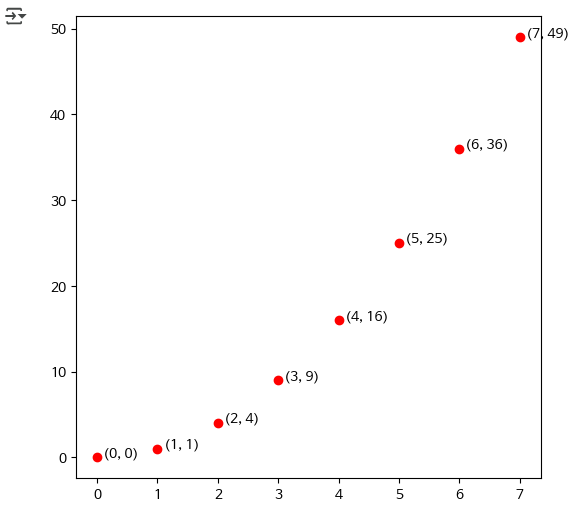
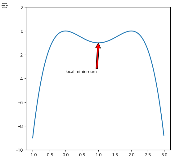
4.6 Annotate
  x = np.arange(-1, 3, 0.01)
  y = -x**4+4*x**3-4*x**2

  fig, ax = plt.subplots()
  ax.plot(x, y, lw=2)
  ax.annotate('local mininmum', xy=(1, -1), xytext=(0, -3.5),
              arrowprops=dict(facecolor='red'))
  ax.set_ylim(-10,2)
  plt.show()
4.7 Color
  x = np.arange(-np.pi, np.pi, 0.02)
  y1 = np.sin(x)
  y2 = np.cos(x)

  fig, ax = plt.subplots()

  ax.plot(x, y1, label = 'sin', color= (0.1, 0.3, 0.5)) # RGB
  ax.plot(x, y2, label = 'cos', color='c') # one of {'b', 'g', 'r', 'c', 'm', 'y', 'k', 'w'}

  ax.legend(loc='upper right')

  plt.show()
4.8 FaceColor
  #ax.set_facecolor()
  x = np.arange(-np.pi, np.pi, 0.02)
  y1 = np.sin(x)
  y2 = np.cos(x)


  fig,axs = plt.subplots(1,2)

  axs[0].plot(x, y1)
  axs[1].plot(x, y2)
  axs[0].set_title('sin')
  axs[1].set_title('cos')
  fig.suptitle('삼각함수')

  axs[0].set_xlabel('x값', ha='left', va = 'top')
  axs[1].set_xlabel('x값')

  axs[0].set_ylabel('sin값')
  axs[1].set_ylabel('cos값')

  axs[0].set_facecolor('pink')
  axs[1].set_facecolor('skyblue')
  fig.set_facecolor("g")

  plt.show()
4.9 Grid
  x = np.arange(-np.pi, np.pi, 0.02)
  y1 = np.sin(x)
  y2 = np.cos(x)

  fig, ax = plt.subplots()

  ax.plot(x, y1, label = 'sin')
  ax.plot(x, y2, label = 'cos')

  ax.legend(loc='upper right')

  ax.grid(color='r', linestyle='--', linewidth=0.5)
  plt.show()
5. 여러가지 그래프
5.1 Line Plot
- marker 참고: https://matplotlib.org/stable/api/markers_api.html
- line style 참고: https://matplotlib.org/stable/gallery/lines_bars_and_markers/linestyles.html
x = np.arange(-5, 5, 0.5)
y1 = x
y2 = x+2
y3 = x+4
y4 = x+6

fig, ax = plt.subplots()
ax.plot(x, y1)
ax.plot(x, y2, marker='s',color='g',linestyle='dotted')
ax.plot(x, y3, color='k')
ax.plot(x, y4, linestyle='dotted')
plt.show()
5.2 Bar Plot
fruits = {'사과': 21, '바나나': 15, '배': 5, '키위': 20}
names = list(fruits.keys())
values = list(fruits.values())

fig, ax = plt.subplots()
ax.bar(names, values)
plt.show()

fruits = {'사과': 21, '바나나': 15, '배': 5, '키위': 20}
names = list(fruits.keys())
values = list(fruits.values())

fig, ax = plt.subplots()
ax.barh(names, values)
plt.show()
labels = ['정직한후보', '작은아씨들', '클로젯', '조조래빗']
user = [9.2, 9.4, 8.6, 9.16]
critic = [5.4, 8, 5.5, 7.17]

fig, ax = plt.subplots()
ax.bar(labels, user, color='g')
ax.bar(labels, critic, color='r')

plt.show()
labels = ['정직한후보', '작은아씨들', '클로젯', '조조래빗']
user = [9.2, 9.4, 8.6, 9.16]
critic = [5.4, 8, 5.5, 7.17]

fig, ax = plt.subplots()

x = np.arange(len(labels))  # the label locations
width=0.35
ax1=ax.bar(x-width/2, user, width, color='skyblue')
ax2=ax.bar(x+width/2, critic, width, color='k')

plt.show()
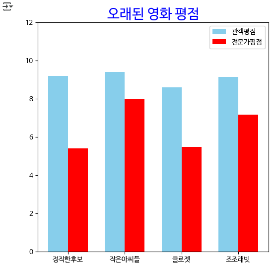
labels = ['정직한후보', '작은아씨들', '클로젯', '조조래빗']
user = [9.2, 9.4, 8.6, 9.16]
critic = [5.4, 8, 5.5, 7.17]

fig, ax = plt.subplots()

x = np.arange(len(labels))  # the label locations
width=0.35

ax.bar(x-width/2, user, width, color='skyblue')
ax.bar(x+width/2, critic, width, color='r')

# ax.bar(x-width/2,user, color='g', width = width, label='관객평점')
# ax.bar(x+width/2, critic, color='r', width = width, label='전문가평점')
ax.legend(['관객평점', '전문가평점'], loc='upper right')

ax.set_xticks(x)
ax.set_xticklabels(labels)

ax.set_ylim([0, 12])

ax.set_title('오래된 영화 평점', fontsize=20, color = 'b')

plt.show()
5.3 Histogram
data = np.random.rand(10000) # [0, 1) 범위에서 균일한 분포를 갖는 난수 10000개 생성

fig, ax = plt.subplots()
ax.hist(data, bins = 10, facecolor='r')
ax.grid(True)

plt.show()
mu, sigma = 100, 15
x = mu + sigma * np.random.randn(1000)

fig, ax = plt.subplots()

# the histogram of the data
# histtype{'bar', 'barstacked', 'step', 'stepfilled'}, default: 'bar'
ax.hist(x, 10,  density=True, facecolor='g', histtype='barstacked')
plt.show()
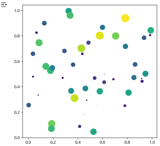
5.4 Scatter Plot
N = 50
x = np.random.rand(N)
y = np.random.rand(N)
area =(20 * np.random.rand(N))**2

fig, ax = plt.subplots()
ax.scatter(x, y, s=area, marker='o', c=area)
# s: size
# c: color

plt.show()
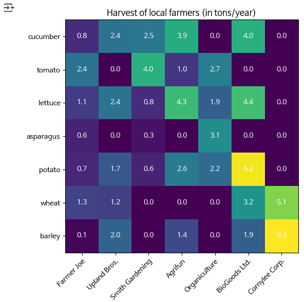
5.5 heatmap
import numpy as np
import matplotlib
import matplotlib.pyplot as plt

vegetables = ["cucumber", "tomato", "lettuce", "asparagus",
              "potato", "wheat", "barley"]
farmers = ["Farmer Joe", "Upland Bros.", "Smith Gardening",
           "Agrifun", "Organiculture", "BioGoods Ltd.", "Cornylee Corp."]

harvest = np.array([[0.8, 2.4, 2.5, 3.9, 0.0, 4.0, 0.0],
                    [2.4, 0.0, 4.0, 1.0, 2.7, 0.0, 0.0],
                    [1.1, 2.4, 0.8, 4.3, 1.9, 4.4, 0.0],
                    [0.6, 0.0, 0.3, 0.0, 3.1, 0.0, 0.0],
                    [0.7, 1.7, 0.6, 2.6, 2.2, 6.2, 0.0],
                    [1.3, 1.2, 0.0, 0.0, 0.0, 3.2, 5.1],
                    [0.1, 2.0, 0.0, 1.4, 0.0, 1.9, 6.3]])

fig, ax = plt.subplots()
im = ax.imshow(harvest)

# 모든 틱(눈금) 보여주기
ax.set_xticks(np.arange(len(farmers)))
ax.set_yticks(np.arange(len(vegetables)))
# 각 해당 목록의 항목으로 라벨 지정
ax.set_xticklabels(farmers)
ax.set_yticklabels(vegetables)

# 틱 라벨을 보기 좋게 회전하고 정렬 설정
plt.setp(ax.get_xticklabels(), rotation=45, ha="right",
         rotation_mode="anchor")

# 데이터에 따라 텍스트 지정 생성 반복
for i in range(len(vegetables)):
    for j in range(len(farmers)):
        text = ax.text(j, i, harvest[i, j],
                       ha="center", va="center", color="w")

ax.set_title("Harvest of local farmers (in tons/year)")
fig.tight_layout()
plt.show()
harvest = np.array([[0.8, 2.4, 2.5, 3.9, 0.0, 4.0, 0.0],
                    [2.4, 0.0, 4.0, 1.0, 2.7, 0.0, 0.0],
                    [1.1, 2.4, 0.8, 4.3, 1.9, 4.4, 0.0],
                    [0.6, 0.0, 0.3, 0.0, 3.1, 0.0, 0.0],
                    [0.7, 1.7, 0.6, 2.6, 2.2, 6.2, 0.0],
                    [1.3, 1.2, 0.0, 0.0, 0.0, 3.2, 5.1],
                    [0.1, 2.0, 0.0, 1.4, 0.0, 1.9, 6.3]])

fig, ax = plt.subplots()
ax.imshow(harvest)
plt.show()
6.저장 (savefig)
savefile_path = './scatter.jpg'
print(savefile_path)
fig.savefig(savefile_path)

import matplotlib.image as mpimg

img = mpimg.imread(savefile_path)
print(type(img))
print(img)
plt.imshow(img)

import PIL.Image as pilimg

img = pilimg.open(savefile_path)
print(type(img))
print(img)
img
7. 실제 데이터로 그려보기
csv 파일을 읽어서 그 데이터를 그래프로 그려보자.
import pandas as pd

cctv = pd.read_csv('https://github.com/SkyLectures/LectureMaterials/raw/refs/heads/main/datasets/S01-01-04-04_01-SejongCCTV.csv', encoding='cp949')
cctv.head()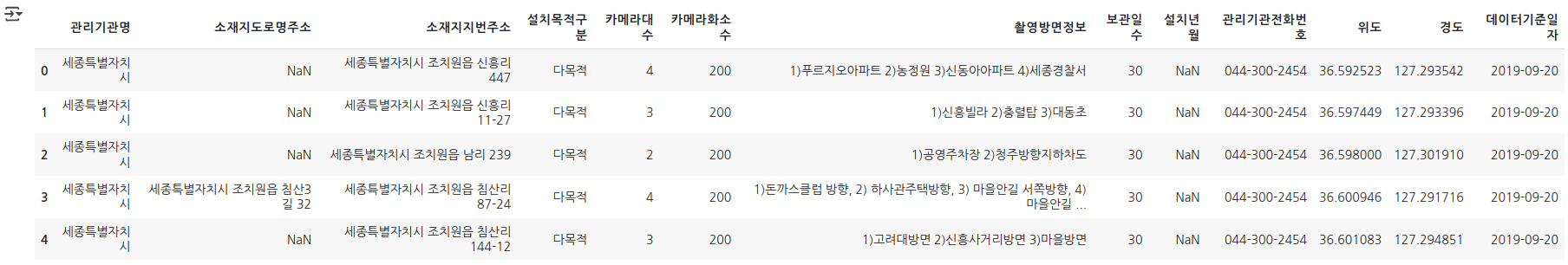
cctv.info()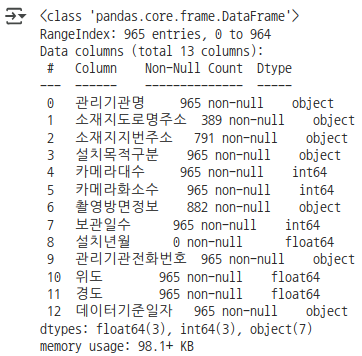
cctv.describe()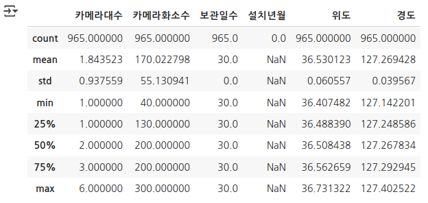
# x축은 카메라 화소수, y축은 카메라 대수
# 카메라화소수가 얼마얼마 있는지 unique한 값을 찾아서 오름차순으로 정렬 ==> x

cctv['카메라화소수'].unique()
cctv['카메라화소수'].value_counts()
data = cctv['카메라화소수'].value_counts().sort_index()

x = data.index
y = data.values

fig, ax = plt.subplots()
ax.plot(x, y)
plt.show()
x는 0부터 400까지, y는 0부터 1000까지로 그래프 범위를 지정해보자.
fig, axs = plt.subplots()
axs.plot(data.index, data.values)

axs.set_xlim([0, 400])
axs.set_ylim([0, 1000])

plt.show()
화소 수를 100만 단위로 Tick을 지정해보자.
fig, axs = plt.subplots()
axs.plot(data.index, data.values)

axs.set_xlim([0,400])
axs.set_ylim([0,1000])
axs.set_xticks([0,100,200,300,400])
axs.set_xticklabels(['0화소','100만화소','200만화소','300만화소','400만화소'])

plt.show()
범례 위치를 옮겨보자.
fig, axs = plt.subplots()
axs.plot(data.index, data.values, label='카메라 화소')

axs.set_xlim([0, 400])
axs.set_ylim([0, 1000])

axs.set_xticks([0,100,200,300,400])
axs.set_xticklabels(['0화소','1백만화소','2백만화소','3백만화소','4백만화소'])

axs.legend(loc='upper right')

plt.show()
그래프에 figure와 axes의 Title을 달아보자.
fig, axs = plt.subplots() axs.set_title('카메라화소') fig.suptitle('화소') axs.plot(data.index, data.values, label='카메라 화소') axs.set_xlim([0, 400]) axs.set_ylim([0, 1000]) axs.set_xticks([0,100,200,300,400]) axs.set_xticklabels(['0화소','1백만화소','2백만화소','3백만화소','4백만화소']) axs.legend(loc='upper right') plt.show()- CCTV 그래프에 x축, y축의 label을 달아보자.
- x축: CCTV 화소수
- y축: CCTV 대수
fig, axs = plt.subplots()
axs.plot(data.index, data.values, label='카메라 화소')

# title
fig.suptitle('화소')
axs.set_title('카메라화소')

# xlim, ylim
axs.set_xlim([0, 400])
axs.set_ylim([0, 1000])

# xticks, xticklabels
axs.set_xticks([0,100,200,300,400])
axs.set_xticklabels(['0화소','1백만화소','2백만화소','3백만화소','4백만화소'])

# legend
axs.legend(loc='upper right')

# xlabel, ylabel
axs.set_xlabel('CCTV 화소수')
axs.set_ylabel('CCTV 대수')

plt.show()
그래프에 text를 달아보자.
fig, ax = plt.subplots() ax.plot(data.index, data.values, label='카메라 화소') ax.set_xlim([0, 400]) ax.set_ylim([0, 1000]) ax.set_xticks([0,100,200,300,400]) ax.set_xticklabels(['0화소','1백만화소','2백만화소','3백만화소','4백만화소']) ax.legend(loc='upper right') ax.set_xlabel('CCTV 화소수') ax.set_ylabel('CCTV 대수') for x_, y_ in zip(data.index, data.values): ax.text(x_+1, y_, '%d대'%(int(y_))) plt.show()fig, axs = plt.subplots() axs.plot(data.index, data.values, label='카메라 화소') axs.set_xlim([0, 400]) axs.set_ylim([0, 1000]) axs.set_xticks([0,100,200,300,400]) axs.set_xticklabels(['0화소','1백만화소','2백만화소','3백만화소','4백만화소']) axs.legend(loc='upper right') axs.set_xlabel('CCTV 화소수') axs.set_ylabel('CCTV 대수') for x_, y_ in zip(data.index, data.values): axs.text(x_+1, y_,'%d, %d' % (int(x_), int(y_))) plt.show()그래프에 화살표를 달아보자. 그 외에도 다른 annotation이 있는지 더 찾아보고 달아보자.
# 707 위치에 '가장 많음'이라고 달아보자.

fig, ax = plt.subplots()
ax.plot(data.index, data.values, label='카메라 화소')

ax.set_xlim([0, 400])
ax.set_ylim([0, 1000])

ax.set_xticks([0,100,200,300,400])
ax.set_xticklabels(['0화소','1백만화소','2백만화소','3백만화소','4백만화소'])

ax.legend(loc='upper right')

ax.set_xlabel('CCTV 화소수')
ax.set_ylabel('CCTV 대수')

for x_, y_ in zip(data.index, data.values):
  ax.text(x_+1, y_, '%d대'%(int(y_)))

ax.annotate('가장 많음', xy=(200,707), xytext=(100,700),arrowprops=dict(facecolor='red'))

plt.show()
그래프의 색상을 바꿔보자.
fig, ax = plt.subplots()
ax.plot(data.index, data.values, label='카메라 화소', color='r')

ax.set_xlim([0, 400])
ax.set_ylim([0, 1000])

ax.set_xticks([0,100,200,300,400])
ax.set_xticklabels(['0화소','1백만화소','2백만화소','3백만화소','4백만화소'])

ax.legend(loc='upper right')

ax.set_xlabel('CCTV 화소수')
ax.set_ylabel('CCTV 대수')

for x_, y_ in zip(data.index, data.values):
  ax.text(x_+1, y_+20, '%d대'%int(y_))

ax.annotate('가장 많음', xy=(200,707), xytext=(100,700),arrowprops=dict(facecolor='blue'))

plt.show()
그래프의 배경색상을 바꿔보자.
fig, ax = plt.subplots()

ax.plot(data.index, data.values, label='카메라 화소', color='r')

ax.set_xlim([0, 400])
ax.set_ylim([0, 1000])

ax.set_xticks([0,100,200,300,400])
ax.set_xticklabels(['0화소','1백만화소','2백만화소','3백만화소','4백만화소'])

ax.legend(loc='upper right')

ax.set_xlabel('CCTV 화소수')
ax.set_ylabel('CCTV 대수')

for x_, y_ in zip(data.index, data.values):
  ax.text(x_+1, y_+20, '%d대'%int(y_))

ax.annotate('가장 많음', xy=(200,707), xytext=(100,700),arrowprops=dict(facecolor='blue'))

ax.set_facecolor('c')
fig.set_facecolor('y')

plt.show()
그래프에 그리드(grid)를 넣어보자.
fig, ax = plt.subplots()
ax.plot(data.index, data.values, label='카메라 화소', color='r')
ax.set_xlim([0, 400])
ax.set_ylim([0, 1000])
ax.set_xticks([0,100,200,300,400])
ax.set_xticklabels(['0화소','1백만화소','2백만화소','3백만화소','4백만화소'])
ax.legend(loc='upper right')
ax.set_xlabel('CCTV 화소수')
ax.set_ylabel('CCTV 대수')

for x_, y_ in zip(data.index, data.values):
  ax.text(x_+1, y_+20, '%d대'%int(y_))

ax.annotate('가장 많음', xy=(200,707), xytext=(100,700),arrowprops=dict(facecolor='blue'))
ax.set_facecolor('cyan')
fig.set_facecolor('pink')
ax.grid(color='r', linestyle='--', linewidth=1)
plt.show()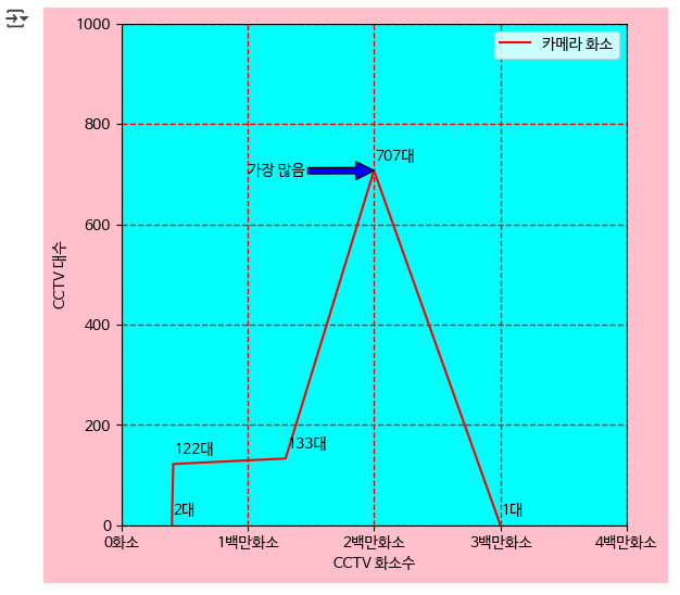
8. 지도에 표시해보기
import folium
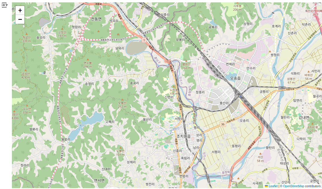
mymap = folium.Map(location=[36.6208541,127.2849716], zoom_start=13) # 위도, 경도, 축척
mymap
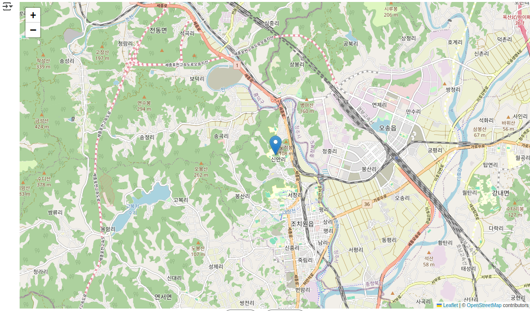
folium.Marker([36.6208541,127.2849716], popup="Hongik Uni").add_to(mymap)
mymap
cctv.info()
cctv.head()
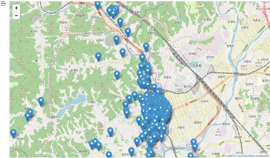
cctv[['위도','경도']]
for loc in cctv[['위도','경도']].values:
  folium.Marker(loc).add_to(mymap)

mymap
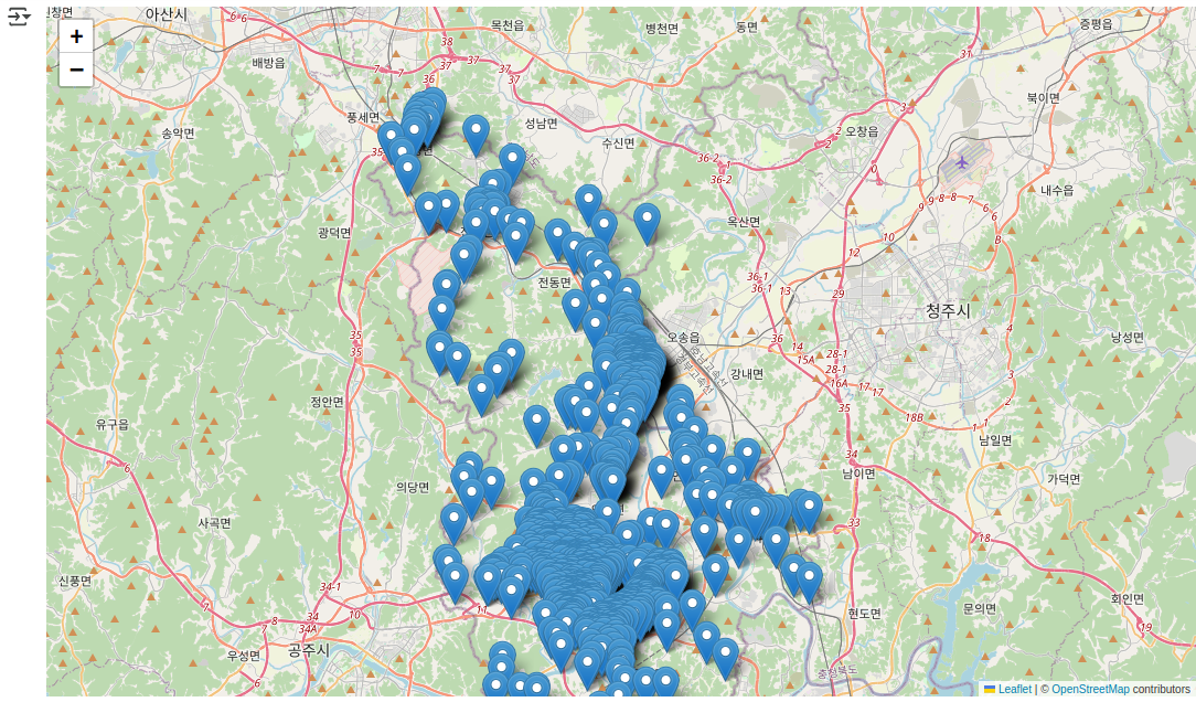
mymap = folium.Map(location=[36.6208541,127.2849716], zoom_start=11) # 위도, 경도, 축척

for loc in cctv[['위도','경도']].values:
  folium.Marker(loc).add_to(mymap)

mymap
light = pd.read_csv('https://github.com/SkyLectures/LectureMaterials/raw/refs/heads/main/datasets/S01-01-04-04_01-DaejeonTrafficLight.csv', encoding='cp949')
light.info()
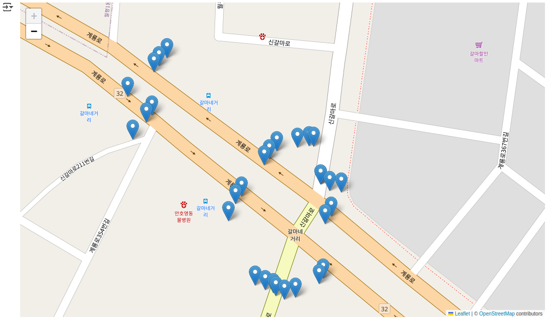
mymap = folium.Map(location=[36.353617,127.3690643], zoom_start=20)

for loc in light[['위도','경도','교차로명']].values:

  if loc[2] == '갈마네거리':
        folium.Marker(loc[0:2]).add_to(mymap)
mymap
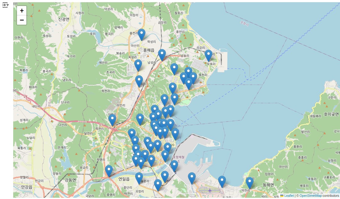
trans = pd.read_csv('https://github.com/SkyLectures/LectureMaterials/raw/refs/heads/main/datasets/S01-01-04-04_01-PohangRSE.csv', encoding='cp949')

mymap = folium.Map(location=[(trans['위도'].max() + trans['위도'].min())/2,(trans['경도'].max() + trans['경도'].min()) / 2], zoom_start=12)
for loc in trans[['위도', '경도', '시설물 위치']].values:
  folium.Marker(loc[0:2], popup=loc[2]).add_to(mymap)
mymap